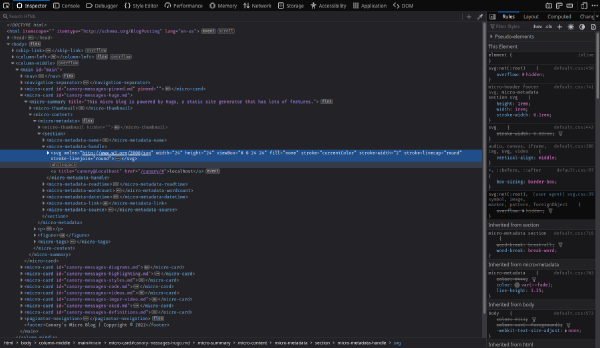
The
“CSS router”
has always been quite the clever trick for navigating sufficiently small sites.
This site uses it to scroll switch pages, and
portable.fyi gets clever with visibility :target
switching. Do it just right and no one notices unless they “inspect the
elements”.

Another wandering soul whispering into the void. If you are looking for my blog you are in the wrong place. The profile and header pictures are brought to you by cdd20.

Another wandering soul whispering into the void. If you are looking for my blog you are in the wrong place. The profile and header pictures are brought to you by cdd20.
It’s always humbling when I get around to reading a web related spec. and have a lot of functionality. JavaScript’s not bad (it’s the easiest part of web development) but gives you just enough rope to do super silly things like reinventing all built in browser functions.

Another wandering soul whispering into the void. If you are looking for my blog you are in the wrong place. The profile and header pictures are brought to you by cdd20.
White spaces in trick many into writing complex — web development is trollish that way. Firefox’s developer tools show generated white spaces! Hopefully your abstraction is munging HTML faithfully. It’s easy to fight white spaces without realising it. That generally leads to using unsuitable display types and other shenanigans.

Index: Cache · Source

Another wandering soul whispering into the void. If you are looking for my blog you are in the wrong place. The profile and header pictures are brought to you by cdd20.
WordPress rants are a joy to read, but where’s the simpler, safer replacement? Never forget that software is highly corporatized and mostly crafted for corporations, not humans. WordPress sits among the few that mere mortals can work with and understand. The complete revival of static sites might save us, maybe.