The Chrome experimental recorder tool has been around for a long while. I thought it was still mostly but I got schooled and apparently, this is a more faster way to jump–start a puppeteer script/test:
Browser rendering engine feel: Webkit (Safari), Blink (Chrome) or Gecko (Firefox)?
Which browser engine “paints” the smartest on my device? In the clip below; Surf substitutes for Safari and Chromium for Chrome. My blog is the testee since there’s guaranteed cache control and jitter.
Surf and by extension Safari (or any Webkit–based browser) wins . Webkit feels smooth (sneakily, too smooth). It’s probably partly why Safari on macOS/iOS feels so fast. Chrome (not Chromium) is almost on par or so I’ve been told. Not exactly web dev but interesting huh?
Profiling is the nice, cozy, and lazy way to efficiency. There’s something neat
about avoiding optimization and having the numbers to prove it relative to an
initial baseline. In PHP there’s
Xdebug and
KCachegrind and I recently saw
php-spx
in my feeds. A
profiler in any language environment with snapshots of performance over time is
just — well nice. The terribad situation is not understanding exactly how
something became slow. It might be too late then.
Messing around with a statically generated site can easily lead into a web/browser spec rabbit hole. And… that’s when I remember exactly why everything ends up written outside the browser’s framework into a framework. I think Firefox is still the only browser that allows easily setting image fallback styling completely with just ?
Hyperscript Tagged Markup (htm) is pretty good. It uses tagged templates.
The Enhance Framework looks compelling. Personally, web components and more particularly the shadow DOM are not very appealing but… the template structure looks clean for drawing up components/layouts super fast while still being primitive enough to not lose transposability between different environments.
It seems like there’s an uptick in discussions online around web components but maybe that’s just the typical developer marketing/advocating. Web components have been around for a bit.
I’ve since realized that Hugo’s architecture provides a variety of template optimization strategies. Hugo builds pages concurrently, so it might be hard to see on a modern device but before partialCaches or module mount trickery — there’s still the implicit complexity of the output/lookup model.
Generally the complexity cost of the default output formats are: page > term > taxonomy > section > home. Keeping expensive calls inside a section and/or a home template is usually optimal. and maybe memory should be the only problems with lots of pages.
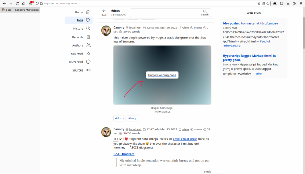
Hugo is a gateway for discovering neat golang libraries. Version 0.104.0 introduced a color extraction method that has lots of use–cases. An easy one is to generate basic image gradient placeholders. The browser has its own deferred/lazy loading logic so fancy image gradients (on a static site) require only a few lines of pre–generated styles.
Reverse pagination is a counter–intuitive strategy for attempting to make links immutable/cacheable and bookmark friendly across older pages. I searched for a visual explanation (difficult to explain concisely) and eventually arrived at an old article on paging . Reverse pagination has its gotchas, but then again pagination itself is one big gotcha.. :-) Well, it depends on the use case really.
It’s kinda neat how
CSS animation rules
are sort of simple in their animation-delay
property also allowed delays between iterations/intervals instead of at the
start only. Interval delays could allow for writing drastically less key frame
rules.
text-animation[hang] {
animation: tilt-rightward 1.3s infinite, tilt-leftward 1.8s infinite;
}